Tuesday, 1 November 2016

Camera Shots and Angles

Camera Shots and Angles
Camera shots and angles are cinematic techniques to create visual information or an effect that alters te audience's reading of a film. 

Types of Camera Shots
First I will be researching camera shots and the effects they have on the audience. Camera shots are used to communicate visual information to the audience and, generally, refer to how much space is shown in one frame. They can be used to demonstrate certain aspects of setting, characters or themes etc. However, they can also be utilised to signify where a significant interest lies within a scene by drawing attention to it through the use of an appropriate camera shot. 

  • Extreme Long Shot - Extreme long shots are the first form of a long shot, they usually depict a vast expansion of a location and generally the subject or character is so far away they are barely or not visible. These shots can be used as establishing shots; they are an effective way (particularly used as the first shot seen in the film) to give the viewer a sense of setting and introduce the audience to where the subject or character is supposed to be. Another use of the extreme long shot, however, is when the director wants the character or subject to look engulfed by their surroundings and are therefore made to look insignificant - generally invisible. These shots generally depict an exterior of a building or a landscape as opposed to an interior. It may be used to show the weather.
This is an example of an extreme long shot from The Hunger Games franchise, which is used to show the huge length of the bridge and signify to the audience where the current location is. The subjects (a group of people) can be seen on the bridge, however, appear as very, very small dark spots on the bridge. This is highly contrasting to the vastness of their surroundings and not only creates an overwhelming effect on the audience once establishing the sheer size, but also signifies the extent the subjects have to travel, which the audience can interpret as them showing dedication. 

  • Very Long Shot - This shot is a balance between the extreme long shot and the long shot - it shows vast terrain or environment but also keeps the subject in focus and blatantly visible. This still establishes location, however, maintains the fact that the character is there despite the largest portion of the shot showing location. It creates a harmony between the character and their surroundings and therefore isn't quite as overwhelming with the setting as an extreme long shot or making the character completely obvious like a regular long shot. Essentially, the subject is just about visible but the purpose of it is to place them in their setting as opposed to the main focus being to establish a setting.These shots generally depict an exterior of a building or a landscape as opposed to an interior.
This photo clearly has the subjects in view, however still shows a heavier fraction of the image as location. It shows you who the subjects are, but maintains the emphasis on placing them in their setting. We can see the vast difference between the size of the location and the subjects, which indicates the enormity of the setting, perhaps suggesting the extent of their travels.

  • Long Shot - This is where the subject fits comfortably from head-to-toe in the full frame, This is to introduce a character in a setting as it is still visible in the frame. It also depicts a character's full physical appearance which allows the audience to form an opinion on the character. If they've first been introduced with this shot it may have been used to allow the audience to make a prejudgement of the character, as they're in full view - they can judge them from their appearance and their fashion sense. The purpose of this is to maintain an equal balance between setting and character, as it provides an extended view of the scenery as well as maintaining the character as the main focus. 
This is a long shot in which the character fits almost perfectly, head-to-toe, in the frame. It allows the audience to see the character in good detail, as opposed to a distant figure like in the very long shot, but also depicts them as part of their surroundings instead of showing them and them alone. 

    • Mid Shot - This shot shows a subject in greater detail, generally from the waist upwards if they are a human. It shows them in great detail, however remains far enough away for the audience to feel as though they are looking at them wholly. This is an estimation of what it would look like if you were having a conversation with someone in real life, as you wouldn't be paying attention to their lower half. This shot is effective if the subject is talking casually, as it isn't an overwhelming view of the character and therefore doesn't effect how lines are delivered because its the most natural shot based on what we see in real life when talking to someone. It's also an effective way of delivering information, which is why this is the most frequently used shot for news presenters etc. It allows room for mild hand gestures of movement. 
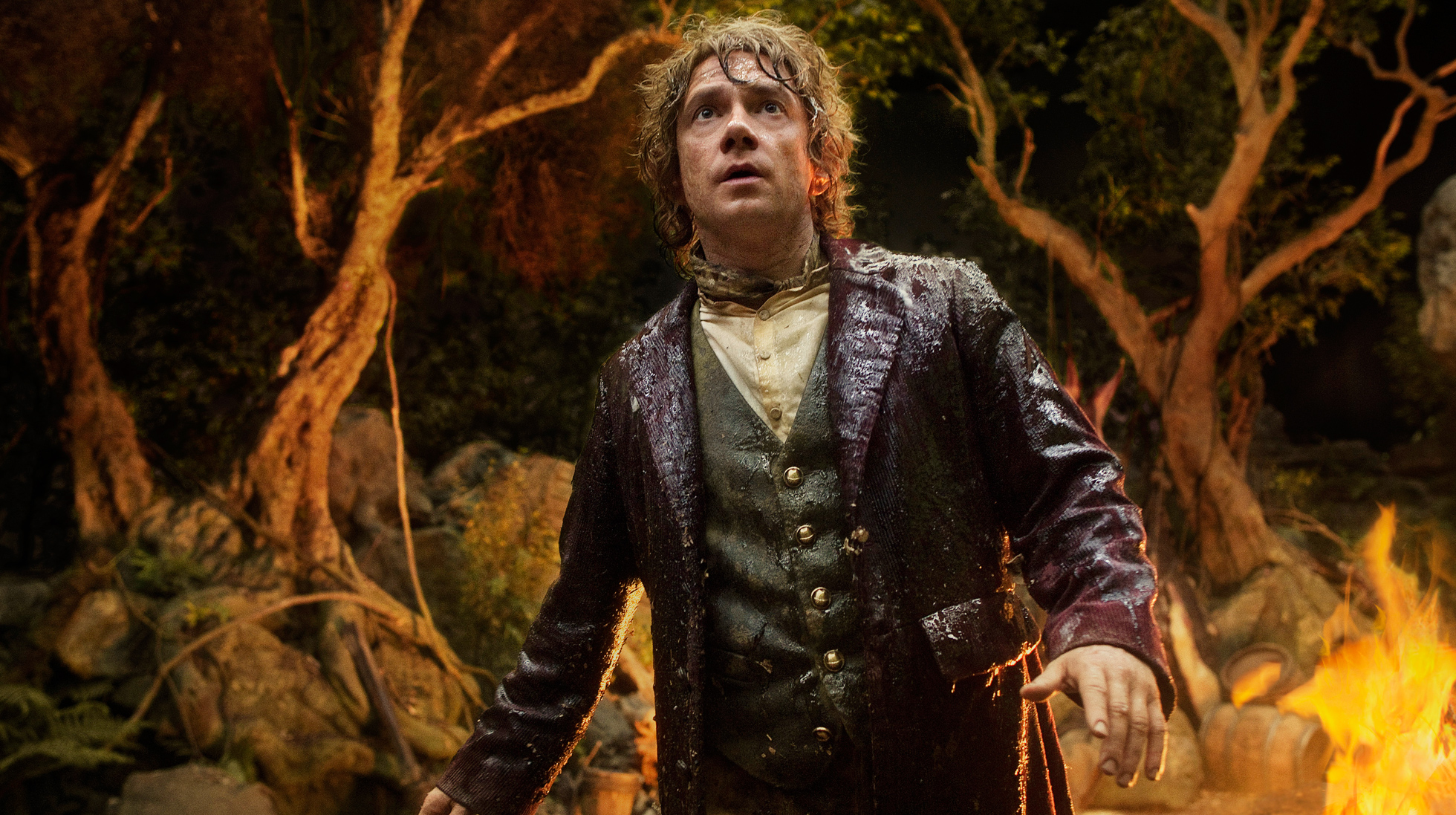
    This is an example of a mid shot, it shows the subject from a medium distance, allowing the audience to see them in detail, but it isn't extremely close and therefore doesn't overwhelm the audience with excessive detail of the subject.


  • Medium Close Up - This is halfway between a mid shot and a close up, generally depicting a character from shoulders/chest region upwards. It shows the character in greater detail than a mid shot without getting uncomfortably close to the subject. 

    • This shows the subject in close detail so they're clearly the sole focus of the image, however they're not uncomfortably close that it overwhelms the audience. 


    • Close Up - This shot shows a portion of the subject (generally face) quite close so that most of the frame is covered by the subject's feature. When showing the subjects face, this shot is used to signify their emotional state as opposed to just delivering information. This is because it emphasises focus on their facial expressions therefore conveying emotion effectively - this is because their facial expressions are not only shown in great detail but also remain the only thing in the frame and are therefor the only thing the audience can focus on because the broader scene is not included. They could be used to demonstrate intricate movement with hands etc. 


    • From this close up, we can see the character's facial expressions in more detail. She clearly has a look of worry or sadness on her face, however this is subtle. Because of the subtlety of this facial expression, if a close up hadn't have been used the audience wouldn't know how she was feeling because any other shot would have been too far away to capture their feeling. The character is the only focus in this image because the broader scene is not in view, this therefore signifies the importance of the character's emotion in regards to the plot etc.
      • Extreme Close Up - This is where the shot is so tight and close, only a fraction of an object or character can be seen. This is to show extreme amounts of detail, generally to convey emotion via something small such as the eyes. It's an unnatural viewpoint because we do not see people or objects from this angle. It can be used to enter a character's intimate space and therefore create an uncomfortable feeling in the audience. It can also be used to draw attention to a particular aspect, especially when used on an object that would otherwise not have been acknowledged by the audience. A form of extreme close up is the choker shot, which depicts a person's face in the entire frame, only it shows from just above their eyebrows to just below their mouth. 
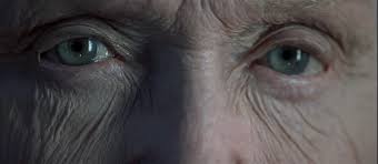
      Image result for extreme close up shot
      This extreme close up shows somebody's eyes. This is an effective shot because it shows intricate details on their face which otherwise wouldn't have been admired or noticed if it was from a shot any further away. By demonstrating the intricacy of their face it may signify beauty that would have gone unnoticed. Moreover, if you look closely you can see that their eyes are slightly glazed, suggesting emotion and tears. Given that it is subtle in this shot, it would have been practically invisible in a larger shot


      • Two Shot - this shot is fairly straightforward - it shows two people comfortably placed in one shot, and generally shows them from the waist and upwards, similar to a mid shot only with two subjects in. They often seen in interviews or when two people are presenting a show together. Two-shots are useful for filmmakers when wanting to signify two character's relationship, depending on how close they are together. When used for presenting, if two subjects show equal prominence within the frame, it suggests that they'll give equal contribution, although this might not always apply. It's a good way to introduce two as equally significant people so that the audience doesn't feel bias towards one because they were introduced first.


      In this image, you can see two people in the shot together, this one shows someone placed further forward than the other, therefore meaning that more of them is in the frame as they are overlapping the other person. This may suggest each persons significance in the film, based on their positioning in the shot. This two shot may signify their relationship, for example, the person placed in front may be more in control etc.
      • Point-of-View Shot - Also known as the POV shot, this shot is used to make it feel like its coming from the subject's perspective as opposed to seeing them from an outside perspective. It generally shows the character's feet or them doing something with their hands so the audience can recognise what type of shot it is straightaway. This shot may be quite unnatural to the audience because they're not used to seeing it from someone else's viewpoint - they are obviously only used to their own. This may be an effective method to get the audience to engage with the character though, as they're witnessing it from their perspective and therefore can put themselves in their shoes - therefore creating a connection between themselves and the character. 


      • Over-the-Shoulder Shot - This shot is framed from behind a character looking at the subject. This is used to show two characters interacting without having both of them entirely in the shot - like a two shot. Moreover, it can frame on the person talking from the front as in order to show both in the frame as well as interacting it'd have to show their side profile. This allows more detail as you can see their entire face and therefore interpret their responses better. Furthermore, it allows the audience to see their positioning and interpret their relationship relationship between two characters based on how close they are standing near each other. It also allows the audience to compare the character's physically, as even though one is slightly out of frame you can still see their height in contrast to the other character. These shots are commonly used during scenes which incorperate heavy dialogue and can therefore be used to alternate between looking at each characters while reinforcing the idea that they're talking to each other by keeping them both in frame. 
      In this image, the audience can see that is from over the shoulder and therefore implies that these two characters are engaging in conversation. The audience can also compare the height difference between two characters, the fact that the character with the angered facial expression is shorter than the character facing him suggests that he may be feeling threatened because the other character is physically dominant over him.

      Types of Camera Angles 
      Camera angles are used to create an effect on the audience. As opposed to what is contained in the frame - like a shot - its based on the direction its taken from. There are camera angles that feel quite unnatural to viewers and there are camera angles that the viewers are used to because they see them in every day life. They help give emotional information to the audience in the way that they guide their judgement. They can be used artistically to be symbolic and create a larger effect. 

      • Bird's-Eye-View - This angle is taken from overhead of the scene, and appears very unnatural to the audience. By positioning the camera directly above the set, it can make everyday objects become completely unrecognisable because they're seen from an angle the audience has never seen them from before - obviously because humans aren't constantly looking down from an extremely high angle. It is from an unnaturally high angle, however still maintains a relative amount of detail of the scene. This is effective when used to create a sense of vulnerability in regards to the characters, as it simulates the idea of them being stalked from above, like a bird's prey. It can highlight the character's insignificance or lack of control in a situation. 
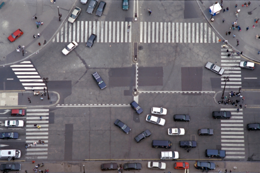
      This is from a bird's eye view, you can see that it's taken from a very high angle, but you can still see what's going on and all the objects and people in the image still. 
      • Aerial View - Aerial view is similar to a Bird's Eye View because its taken from overhead, however is from a much higher angle so all intricate features, for example objects and people, are too far from view to see. This gives off the impression that it's been taken from a satellite or a helicopter, because it's from such a high angle. It is generally used to establish a scene, if paired with an extreme long shot, as its too far away to introduce a subject. 
      This is an aerial view of New York City, you can clearly see that only large things, such as buildings, bodies of water or collections of trees, can be seen. Things such as people or vehicles cannot be seen because it is from such a high angle. This gives a sense of the sheer size of a location, but can also be an interesting angle to use because it shows beauty out of something that would normally be quite bland from an everyday angle a human being would see. 


      • High Angle - This shot is also taken from overhead, however is from a less extreme angle so there is more detail in this shot in contrast to aerial or bird's eye view angles. Although still from an unnatural viewpoint, it focuses less on the setting but more on the action unfolding. This is because the audience can see what's happening in great detail because it's not from too high an angle. This can create a sense of vulnerability or submissiveness too, as the audience is above the subjects and seems like they're in control. 
      This is a high angle. This shows the subjects looking up at something past the camera, so it gives the impression the angle is coming from the area in which they're looking's perspective. This reinforces the idea of vulnerability, as they look quite worried or threatened, signifying that whatever is above them is harmful as it looks like its coming from a predator's view.

      • Low Angle - low angles are when a shot is filmed looking up at the subject as opposed to looking from the same level or from above. These add height to subjects and is a useful technique to make short actors look taller - as this may be seen as more desirable and attractive. Furthermore, adding height may make the subjects look more intimidating and makes the audience feel powerless and perhaps vulnerable. It invokes fear and insecurity because the subject is above them if they immerse themselves in the scene. It can create disorientation for the viewer because the floor cannot be seen and therefore they can't see exactly where the subjects are placed. A low angle may make people look quite unflattering, making people look 'ugly' may be symbolic of the ugliness within them because beauty is associated with heroes and unattractiveness is associated with villains. If a character looks unattractive the audience may interpret them as a villain. 
      This image shows two subjects from a low angle, ignoring the fact that they're acting is intimidating, the low angle makes the audience feel like they're in the position of the victim, and therefore feel insecure because they are being dominated by the subjects on the screen. The audience cannot see whereabouts they are because most of the background is hidden and all that can really be seen is the middle of the trees and not the floor. 
      • Worm's-Eye-View - Worm's eye view is the direct opposite of bird's-eye-view, typically used to capture scenery as opposed to people. It generally shows objects shown from directly below so that the vanishing point is at the top of the object. It can be used to add height to an object and make it look powerful and mighty. It can disorientate the viewers because they can't see what's going on on the ground, where the action would generally be taking place, and therefore it hard to tell where they are situated. A good use is to use a worm's eye view paired with a point of view shot, so it looks like its from the perspective of someone on the ground. This can help the audience understand how the character is feeling because they can see the overwhelming view of the sky or ceiling too. 
      This is a worm's eye shot showing trees, the base of the trees cannot be seen and the vanishing point is at the very top of the tree. It's an interesting shot to use because it draws the viewers attention to what's above as opposed to what's on the ground - which is what people would normally pay attention to. This signifies the beauty of nature and the sky if people took a chance to look up and admire it.

      • Eye Level (Neutral) - This shot captures the subject from their height and therefore imitates a human actually looking at the scene, as it is at average height and therefore shows the most natural viewpoint. This is one of the most common angles as it has a neutral effect and therefore doesn't connote anything about the action or characters. It doesn't have any emotional impact on how the audience interprets the scene and therefore works well when delivering information and facts. It's easier to separate the background from the subject because they're not enmeshed in the background and don't look apart of it like they would from a high angle. It's relatable because its where the audience would normally see things from, moreover, it's more intimate because there is nothing effecting how the audience interprets the character. Shooting at eye level allows the audience to respect the character because they're not seen as submissive or dominant: they're on the audience's level. 
      This shot depicts the character at eye level. By having it at this angle it doesn't make the character look dominant or submissive, the audience can engage with them because they can see the character in a neutral light and more intimately, as opposed to a completely separate area to simulate it as though the audience is above or below the subject.

      • Oblique/Canted Angle - this is where the shot is taken when the camera isn't horizontal to the floor, it's seen from a tilted angle and is therefore very unnatural as the audience would be used to seeing things from straight angles unless they slanted their head to the side. It can be used to portray unsteadiness, disorientation, uneasiness, tension or even intoxication. Not only can it be used to disorient or disturb the viewer, it creates dramatic effect to intensify drama or frantic action scenes by creating tension and making the scene more chaotic because the audience not only has to pay attention to the plot, but also has to adjust themselves to this odd and unnatural angle. It can be used to manipulate how the viewer sees the film - for example it could make the audience think the subjects are walking on one thing when in fact they're not. 
      This is the canted angle being used to create tension and uneasiness in the viewer, it correlates with the action in the scene and therefore is used effectively to intensify the drama.

      Why Use a Selection of Camera Shots and Angles?  
      Camera shots and angles are film techniques - film techniques are what is used to create meaning within a film. Camera shots are used to convey visual information about a setting, theme or character. They help the audience understand relevant and significant information based on what is contained within one frame. They can provide a sense of intimacy, exposure or insignificance for a subject, however their key purpose is to convey relevant visual information within a scene, for example where it's set and who is involved. It is important to use a selection of camera shots, especially during particular moments of a scene, to put forward relevant information and ensure the audience's focus remains on the significant aspect of a setting. For example, a long shot would not be used if the audience was only supposed to be focused on a certain character or object likewise with a close up; a close up would not be appropriate if the director wanted to establish a setting to the audience, as the audience wouldn't receive a sense of setting in a close up because it does not depict the setting. If there is lots of visual information needed to be conveyed to the audience, it would be more effective if they did this in segments through a selection of different camera shots - this way the audience isn't overwhelmed with mounds of information and can be introduced to certain significant aspects slowly through the use of various shots. Furthermore, using certain shots draws attention to different things, so if all the information was conveyed through one shot then the audience cannot acknowledge and pay attention to every aspect in the scene because there would be too much to focus on. 
      On the other hand, camera angles are used to manipulate the viewer's interpretation of a scene and symbolise deeper aspects of a film. They position the viewer so that they can understand the relationships between characters, psychological aspects of characters (for example if they are seen as dominant etc.) as well as other in depth analyses based on the connotations conveyed through the use of different angles. It is principle to use a selection of different camera angles because they change how the viewers read the film based on the connotation or effect produced by the angle - for example a low angle can be used to make someone look intimidating whereas a high angle can make someone seem vulnerable. Using a high angle on someone who is supposed to appear intimidating won't work well, which is why its useful to use a variety of angles as opposed to the same angle all the way through the film. Moreover, it allows the audience to see things from different perspectives which may be refreshing or insightful because they've seen something from every angle.

      How do Camera Shots and Angles Aid Storytelling?
      Camera shots and angles aid storytelling by communicating information to the audience as well as manipulating how they interpret scenes. Types of camera shots are defined by the amount of space contained in the frame and therefore conveys visual aids for the audience to understand relevant or significant information. This aids storytelling because they can be used to make sure the audience understand what is going on and therefore do not sit through the entire film confused. Moreover, they can be used to convey minor information - for example an object in the background - to add clues for the audience regarding the plot or what the character is like. This makes the film more subtle and realistic as opposed to directly telling the audience about someone or the plot through dialogue or even breaking the fourth wall - it's more natural because people in real life wouldn't constantly put across information as though there's an audience needing to understand. Camera angles aid storytelling because they help the audience interpret something about the film and therefore understand relationships or characters throughout the film. They can create tension too, therefore help change the mood of the film and fit the genre.

      Types of Camera Movements

      • Tracking - This is when the camera moves to follow a subject, generally horizontally and looks very smooth. It is generally used to follow a subject.The footage isn't shakey and is generally achieved by mounting a camera to a platform and rolling it along tracks (tracking), mounting the camera to a dolly and moving it freely along an open floor, or mounting the camera to a steadicam and moving it by hand. 
      • Panning - When the camera is rotated horizontally while remaing stationary. It resembles the motion created when a person turns their head in a stationary position. 
      • Tilt - This is when a camera points upwards or downwards while in a stationary postion. It's similar to panning, however, tilts vertically and remains in one position.
      • Zoom - This is when the camera looks at a subject from one shot (eg a long shot) and then gradually (or quickly), but smoothly transitions into a different shot (eg. a close up). This is achieved by zooming in and out with a lens. 
      • Arc - This is when the camera moves around a subject in a semi circle. Essentially it pans 180 degrees in a half circle.
      • Pedestal - This is when the camera moves up or downwards, as opposed to staying stationary like in a tilt.
      • Dolly Zoom - This is zooming, except its done by moving the camera on a dolly while simultaniously moving the lens the opposite way. This makes it seem as though the background is changing while the subject[s] stays the same size.


      Examples of Specific Camera Shots in Film Openings: 

      Se7en (1995, David Fincher) 
      This film opening utilises close-ups and extreme close-ups prominently, featuring intricate action using objects or hands. This puts the focus on the intricate detail as opposed to establishing a definitive location or character. This is effective because it maintains the mystery and therefore doesn't giveaway any plot or characters. However, the audience are given the opportunity to infer something about the plot or characters based on what the close up is of. For example, the items being used are very artistic things eg. books and drawings, this may suggest something about one of the characters. Moreover, one shot contains an extreme close up of skin being shaved off a finger with a sharp razor - the extreme close up was an effective choice because it allows the audience to solely focus on this. For example, if a mid shot had been used for this, the audience might not have even noticed what was happening to the finger because there would have been too much in the frame to focus on eg. the rest of the person. This would take away the horror of what is going on and therefore wouldn't have the same effect of disturbing the audience. Furthermore, it disturbs the audience more because the graphic content is shown in great detail as opposed to lower quality because its further away. This opening sequence creates mystery because the audience do not know where it is situated or who is involved - this is because of the use of close ups not revealing anything like this by not containing it in the frame.


      Submarine (2010, Richard Ayoade) 
      In this film opening sequence, different variants of long shots (eg. extreme, very) are featured predominantly. These are used to introduce the character and the setting - this gives the audience an idea as to who the film follows and where it is set and is fairly straightforward because it literally shows the audience who is involved, removing any mystery as to who the film is about. This gets the basic information out of the way quickly and leaves more time to develop the plot during the film. The first shot seen is a tracking long shot across the interior of a bedroom - assumed to belong to the character introduced in the same shot. The choice of the long shot was effective because it captures in the frame many elements of mise-en-scene which indicate what the character is like and how old they are based on the objects included in the frame. When the long shot/extreme long shot is incorporated on the landscapes it is effective because it gives the audience a sense of setting - suggesting the scenery might be a prominent factor in the film. A mid shot is used with back lighting to make the character appear like a silhouette. This mid shot is nice because although the background is featured heavily the main aspect that stands out is the figure because they are quite close to the camera. This therefore doesn't drown the character out in the background and creates a balance between the two, which is both aesthetically pleasing but may also suggest the significance of the character and his relationship with his surroundings.


      Chariots of Fire (1981, Hugh Hudson) 
      A varied selection of shots are used in this film opening sequence. It opens with a very long shot of a church, without the text at the bottom the audience wouldn't know it was specifically London, however the style of the buildings around may suggest where it was set. This shot is effective because it gives a sense of setting to the audience and establishes where the sequence of shots to follow are based in. Moreover, it suggests to the audience that the setting may correlate with a theme in the film - perhaps religion. It may also suggest that the characters are religious because it's set inside a church. The next shot depicts another long shot inside the church, of a person speaking in front of a crowd of people. This shot is effective because it allows the audience to understand what is happening inside the church, istead of just cutting to the shot of the speaker alone, it shows who he is speaking in front of. The next shot is a mid shot of the speaker, it allows the audience to see him in more detail and perhaps suggests that he's a significant character in the plot. Another mid shot is used to capture the upper halves of the crowd, allowing the audience to see their reactions to the speaker - they look bored. In the middle of the shot, a man looks up at the speaker with discontent on his face, this suggests there is some sort of connection between the speaker and this man, as nobody else in the crowd react this way. This shot allows the audience to be made aware of this by showing the man in relative detail and including him in the shot - although its quite subtly done. The next shot is of a close up, depicting the bottom halves of a group of runners legs on sand. This introduces a new and separate group of characters from the last scene and establishes a new location - most probably a beach as they're running on wet sand. The shot is far enough away to see that there are many legs - making it clear that it is a group of characters as opposed to one or two. The shot then pans upwards into a tracking mid shot of one particular character, suggesting the significance of him. It does this to a few other characters, noting to the audience who the main characters of this film are. It then cuts to a very long shot where the characters are fairly distant from the camera. This enmeshes the characters into the background and therefore signifies the vastness of their surroundings, as well as making it clear where it is set by focusing mainly on the background. Another long shot is used to depict a separate building, where the characters run into shot. This shows the audience where the characters are running and gives a sense of setting - A coastal town (as buildings are visible and they've just run from a beach.


      Examples of Camera Angles in Opening Sequences:

      Reservoir Dogs (1992, Quentin Tarantino)
      In this opening sequence, the majority of the angles are at eye level - especially whilst individually introducing the characters. This suggests the relationships of all the characters are very balanced because they're all captured at eyelevel. There is no connotations suggesting one is more control as they're all filmed at the same level. Moreover, eyelevel is a very neutral angle, which suggests that the characters themselves are very balanced people. Not much can be interpreted about the characters because the eye-level angle is quite neutral. It doesn't have any emotional impact on the audience however they stand out because they aren't one with their background - they're significant. If a high shot had been used it would make them seem as though they were part of the ground and would reduce their significance as characters because they would be enmeshed in their surroundings. On the other hand, it imitates as though the characters were walking towards the audience as its the most natural angle seen in real life. This may intimidate the audience based on how they're dressed and the manner they conduct themselves in. 


      Inception (2010, Christopher Nolan)
      In this opening sequence, the protagonist is first captured from eyelevel (although he is laying on the ground), this allows the audience to connect with him because it is quite an intimate angle and imitates as though they were laying next to him. It then shows children playing on the beach from a low angle, as though it was captured from the protagonist's perspective. This reinforces the connection between the audience and the protagonist because it's as though they can empathise with him better because they put themselves in his shoes by witnessing things from the same angle as him. Furthermore, the low angle of the children make them look bigger and more intimidating, which is quite artistic because it juxtaposes the pureness and innocence associated with children. The protagonist is also captured from a high angle, this is effective because it makes him look vulnerable - which correlates with the situation at hand (him laying confused in the ocean waves). A high angle is used to capture the man in uniform, this makes him appear larger and therefore dominant and intimidating. This may render the audience threatened by this character, and therefore interpret him as as a potential antagonist. This angle may make him appear larger and more dominant to symbolise his power associated with his occupation - his uniform indicates he's in a significant job and the low angle may emphasize this.


      Deadpool (2016, Tim Miller)
      In this film opening sequence, it mostly features high angles (captured with a tracking shot, the entire opening is a tracking shot so there are no cuts). I think the use of high angles could be to disassociate the audience from the film and its events by looking at things from above, and make the audience feel superior to the characters. This has a contrasting effect to the majority of the film as the audience is often addressed by breaking the 4th wall. Because everything is paused, it's as though the audience is spectating an exhibit as opposed to an actual scene, and the use of high angles could be used to make the audience feel as though they are looking at things from a superior angle - they can feel like a God in some sense, particularly with the pause it's as though they have power. The first character is seen from a high angle which correlates with his action because it victimises him and makes him seem vulnerable to attack, which is amusing because he is being attacked.


      What Effect Does Shorter Shot Lengths Have?
      Shorter shot lengths in terms of time allow the audience only a short amount of time to observe something in that particular camera shot. This is when insignificant information can be put across, because the audience doesn't need a long time to acknowledge it. On the other hands, short shot lengths can be used to introduce a reference to something by quickly flashing on screen, creating a challenge for the audience to spot it. They won't get boring for the audience to see because they don't last too long, moreover many short shot lengths in a sequence can make the film look chaotic, which therefore may suit the action or mood of the scene.

      Shorter shot lengths in terms of depth of field means how much the camera focuses on. A shallow depth of field contains only a small amount in the frame in focus and is defined by the aperture of the lens; the larger the aperture the shallower the depth of field will be. Using a shallow depth of field is useful to keep important things in focus so the audience will pay attention to that particular factor. Anything irrelevant or insignificant to the scene will be out of focus. Essentially, it highlights important aspects within the composition of a scene.


      Shorter shots lengths in terms of space contained in the frame allows the audience to see something in more detail. This could be used to highlight or emphasize a specific element to the audience, for example a facial expression they otherwise wouldn't have noticed in a larger spaced frame. By keeping the image tight it can help the audience feel intimate with the characters, which may develop their connection with them. Moreover, it may create an overwhelming effect on the audience because the camera is so uncomfortably close to the subject.

      What Effect Does Longer Shot Lengths Have?
      Longer shot lengths in terms of time allows more time for the audience to observe the scene. This can be used to capture a particularly long action, or even allow the audience to acknowledge everything significant within the frame. If a certain object or character is focused on for a long period of time, it suggests to the audience that they/it may be significant to the film's plot. Take a key for example, if in one shot someone drops a key, and the key is focused on for a long time, this implies that the key is vital to open something important for the plot and it sends the audience into a panic because they know that the key is important, even if dropping the key doesn't have immediate effect. Using a small depth of field is best suited when focusing on small, individual objects etc.


      Longer shot lengths in regards to depth of field means the camera is focusing on more. This is because the depth of field is deep because the aperture is small. This can be used to capture more in the image, which may be vital if a lot of significant aspects are incorperated into one frame. For example, capturing a location would be more effective using a larger depth of field becuase there is more to focus on.

      Longer shot lengths in terms of space contained in the frame allows the audience to see more in the shot. These can be used to establish a location and give the audience a sense of setting. Moreover, particularly in extreme long shots, they can make a character look isolated and enmeshed in their surroundings because they look so small and insignificant in contrast to the location.

        Saturday, 29 October 2016

        Mise-en-Scène Research

        What is the Purpose of Mise-en-Scène?
        Mise-en-Scène is a common concept in stage and film, literally translating from French as 'putting on scene'. Regarding cinema, mise-en-scène refers to everything that appears in front of the camera, cinematography and editing.  It is the use of visual aids to aid storytelling through representation. The physical aspects of mise-en-scène (the properties appearing in front of the camera) may include composition, set design, lighting, props, actors, costume, location etc. It essentially works as visual information for the audience and can establish key information including era, time, region (culture) and perhaps even a character's state of mind. The composition consists of the positioning and movement of actors and object in the camera's frame. 

        Depending on the director's vision, the components of mise-en-scène can confer a sense of realism, or even fantasy, onto the film, but it helps make the entirety of the film seem believable. 

        Components of Mise-en-Scène
        • Set Design - this refers to the setting of the scene and placement of the props visible. This can clarify to the audience what era it is based in, based on the style of the props and set. For example, a period piece would contain antique appearing props. Contemporary, electric based items would not fit well in a period piece as they wouldn't have existed, this would make the film seem amateur and unrealistic, and it may even confuse the audience. A film where it takes the audience a very long time to assume what time it is set in (where this effect isn't intended) has poor mise-en-scène because it doesn't supply enough visual information for the audience. Another thing the set design may suggest is the whereabouts of the film. For example, if the set was clearly domestic appearing, it can be assumed to be in a house as opposed to a professional environment. The set design may also suggest what a character is like before they've even been introduced, for example, if the set is blatantly a room with a single bed and posters on the wall and dirty clothes all over the floor, it can be assumed that it belongs to a teenager, based on what's typically associated with this age group. Moreover, because it is messy, the audience can guess what the character who lives in the room is like, as a tidy room would insinuate that the person is organised etc. It can also suggest their interests, for example the posters may depict a band, and suggest not only that the character likes music, but what kind of music they're into. Even if the band isn't recognisable to the audience, the composition of the poster (including colour, costumes of people etc) can suggest what sort of genre they are. This proves that even minor details regarding set design can bestow so much visual information onto the audience. Some people can choose whether to film on location or set, location would require a lot less setting up as it already looks how its supposed to. The director and set designer coordinate this aspect.
        From this set design, it can be assumed that this is based in a
        domestic suite, as it's quite homely. You can tell that the house
        in which this room inside belongs to wealthy occupants as
        the objects inside are very expensive and luxurious appearing.
        It is well kept and coordinated, this suggests that the owners of
        the house have taste as well as are quite organised and care about
        what their house looks like. Although the room is very stripped
        back and simple, it features small artistic qualities (the painting
        for example) and therefore suggests that the owners are quite
        cultured. It has both traditional and contemporary objects, but 
        the 

        inclusion of contemporary props suggests that its set in the present.

        • Lighting - the intensity and direction of lighting can change the mood of the film, as well as how the audience interprets the characters, actions and themes. It can be used to emphasise certain properties, including texture, shape, distance, mood, time of day, season, glamour etc. Furthermore, it affects the way colours appear, slightly changing the hue or depth. This can be seen in everyday life, for example under artificial light, objects generally look either orange or blue (depending on the colour of the bulb), whereas in natural daytime light, objects are generally quite neutral coloured. Lighting can also draw attention to a particular aspect of the scene by creating a spot light or having contrasting shadows and highlights. Highlights draw attention because the focal interest becomes more visible in contrast to the shadows. Shadows can make things look smaller, but they can also make it seem dark, gloomy or frightening. In a horror film, dim, contrasting and artificial lighting would be more effective because it conceals and therefore creates an eerie or mysterious effect, whereas a more lighthearted family film would use brighter natural lighting because it appears more innocent and lively. Lighting is a huge part because it can dramatically alter how the audience perceives things in the film. It can signify a dominant role, for example something that is supposed to stand out would be bright against a shadowy background by casting light over the focal object. It can also be used as a beauty enhancer, because lighting can accentuate certain features on a face and therefore make 'beautiful' features appear more prominent and conceal 'unattractive' aspects of the face. Lighting also has many connotations, for example, exposed lighting connotes truthfulness, happiness and innocence, whereas dark lighting connotes deceitfulness, evil, depression or even anger. Backlighting is where it is heavily lit behind a figure of interest, causing them to become a silhouette or very dark and not very detailed. Cinematographers coordinate the camera and lighting.
        These two images depict the same woman, however in different lighting. This
        signifies how much lighting can change the appearance of things. The left-hand
        image is more exposed to the light, and therefore almost all of her face is lit with
        no conspicuous shadows. This makes the woman seem friendly and open.
        In the picture on the right, the woman is pulling the exact same face, except she
        looks so different. This is because she is in high contrast lighting so there are
        harsh shadows cast across her face and dramatic streaks of lighting. There is barely
        an in-between. Adding shadows across her face makes her seem evil, and therefore
        has a more horror/thriller fitting. Her eye is almost entirely concealed, which adds
        an air of mystery to the photograph.


        • Space and Framing - The portrayal of space can alter the audience's interpretation of the film.  Changing the camera positioning, angles, lenses and the lighting or set design can warp the depth, size, proximity etc. of objects and places in the film, and allow the audience to understand relationships between certain elements. Space is defined by what the frame of the image includes. Deep space is used when significant objects are both near and far from the camera, having lots of depth allows the audience to see both significant elements. It can be used to help the audience understand where characters stand in terms of their environment - how far away they are from a point of interest etc. This could also be used to create the illusion of isolation, as a singular element of interest is against a huge background etc. Shallow depth has a more artistic appeal, as it can add an air of ambiguity because some of the visible space may be cut off etc. Moreover, space can be used to change the mood, for example, filming in areas to make it look small and confined can make it seem chaotic and trigger the feeling of suffocation in the audience whereas filming in large open areas gives a more relaxed feeling to the film. There are ways to manipulate space by changing certain aspects, for example, smaller objects will look further away, overlapping will add depth etc. 
        In this photograph I took, the viewer is given an indication into the space
        by the background and the two figures (the ducks) in the image. For example,
        the duck in the foreground is a lot larger than the duck in the background,
        this suggests that the duck in the foreground is in front of the other duck, even
        though they aren't overlapping, because the size of the other duck suggests how
        far away it is from the duck in the foreground. The spatial relationship between the
        two ducks in this photograph may also (if it were part of a film) give an indication
        as to the actual, abstract relationship between the two characters, as they are not
        intimate. Furthermore, the background clearly depicts a vast body of water, as the
        end of it is not included in the frame. This suggests how much space there is in
        the entire location, as there is no visible end. Having taken the picture, I know
        that there was an end, it was in fact taken on a small loch, however, the
        viewers of the photograph cannot guess this because there is no visible end.
        This shows how what is included in the frame can change how the viewer interprets
         the size of the space. There is quite a relaxing aura to this image, as
        it is such an open space and isn't compact or chaotic with objects and characters.


        • Composition - Composition refers to the organisation of the actors, objects and space within the frame. It is often seen as important to keep the composition consistently symmetrical in order for it to seem professional. This means having an equal distribution of light, colour, objects and/or characters in a shot, however, an unbalanced composition may be used in order to draw attention to a particular element as it looks odd to the audience and they'll pick up on it much easier. The placement of characters can help indicate the significance of each character, for example, a character in the foreground suggests that this is the most significant character whereas the character being in the background suggests that they are not significant. This, however, might not apply to over the shoulder shots, this is because the person behind the other character is fully in the shot and therefore the main focus.
        In this photograph, the puppy sleeping at the front is the one assumed to be the
        focal figure in this image - ignoring the fact the other puppies are out of focus -
        this is because he is positioned at the front, slightly overlapping his sister. If one
        of the other puppies had been positioned at the front, it would be assumed that
        they were the one the audience were supposed to be focused on. Moreover, the
        pup at the front is almost entirely in shot whereas the other puppies are slightly
        cut out of frame. However, the puppy is slight to the right, keeping the other
        puppies in the shot, which is perhaps a method to get across information (that he's
        among his litter) to the audience. 

        • Costume, Hair and Makeup - This simply refers to what clothes the character is wearing and how their hair and makeup is styled. Not only can this indicate to the audience what the character is like but also what time, era, culture and region it is set in. It suggests what a character's personality is like, for example, if a character is dressed in quirky, extravagant clothing it can be assumed that they're quite eccentric themselves, whereas if a persons dressed in a suit, it can be assumed that they're quite organised and have their life together. It also suggests their occupation, for example if they're wearing uniform with a specific brand or indication of job on - i.e. a police officer or a company salesman. Not only does it suggest these things about the character, it can help the audience understand where its set or in what culture. If the character's are wearing something that is culture specific i.e. a sari, then it can be assumed that the film is set in India or elsewhere places associated with these cultural clothing, or even just among a community that practice the culture (even if they don't live an area where it is custom). Moreover, it can suggest what era, for example, if it was a period piece they would be wearing old-fashioned clothing that is easily distinguishable as antique. It might even suggest time of day, if they are wearing pyjamas it probably indicates that its set at nighttime or early morning, as it wouldn't be appropriate to wear pyjamas at other points in the day. If it was during daytime, then this suggests that the character is quite slobbish and lazy, as they haven't been bothered to change.
        From this costume, you can infer that its set in the early to mid 20th century,
        if I were to take a precise guess as to what decade I would say the 1940s. They
        look quite expensive and refined, which would suggest that the woman is wealthy
        and posh. The outfit is fully accessorised which suggests that she has a taste for
        fashion, moreover her hair and makeup has been done quite carefully so she
        looks like she is quite high maintenance and definitely not unkempt. This shows
        that she's probably quite organised and dedicated because she takes the time
        to make herself look 'presentable'.

        • Filmstock, Editing and Colour - Filmstock is whether it is filmed in black and white or if it is grainy or not. Feature films generally aren't black and white or grainy as they are often desired to look pristine in order to appear professional. If it was grainy or in black and white, it would look similar to an old movie or it would look quite grungy and gritty. This effect may be used, however, if the director is trying to produce something that isn't professional looking - this style is often unnerving. This may be applied to make it artistic. The use of colour is quite important because colour has many different connotations, darker colours often connote mystery or fear whereas lighter colours may connote happiness. Colour may also be used to draw attention to something, for example, if the majority of the picture is one colour however one singular element is a completely contrasting colour, this would draw the audience's attention to that element because there is a contrast and it stands out more because it's different. 
        I edited an old photograph I had taken of my dog to illustrate the differences colour correction can make on the way the audience interprets the mood of the film:

         This photo is very saturated in colour and has very bright colours. It has blue and green undertones which are slightly reminiscent of nature. Nature is associated with purity and therefore adds a feel of innocence to the image. Because the colours are so bright, it connotes happiness as colour and light are strongly associated with summer and happiness. This look would suit a lighthearted film, as it helps the audience interpret the film as happy. If this filter was used over a horror movie, it would look out of place as it doesn't have a very scary effect.


        This photo is far less saturated in colour, so it's not as lively as the other image. It has more red undertones, which can connote more adult themes. The image is a lot darker, which is often associated with fear or other negative emotions. This is far more grungy than the other edit so it would suit a more grown up theme - it would work particularly well in a horror film. This moody filter wouldn't suit a happy film because it takes away any happiness or humour because it connotes sorrow or fear instead of happiness. There is less contrast so it's not as striking either.


        Mise-en-Scène Applied to a Photograph 
        In this image, it depicts a scary house. This is made scary because of the inclusion of certain mise-en-scene elements. For example, there is not much natural lightening. This is because natural lighting eg. sunlight, is associated with pureness and happiness. In this image, the only form of light is from the moon (assumed to be based on the bluesh tinge) and the shard of lightening pictured in the background. Lightening is associated with fear, making that incorperation fitting, and the moon is associated with night, which connotes darkness and fear. The house has shattered windows, distressed wood and boarded up entrances, which conforms to the typical appearance of a scary house. The image has blue tones which is associated with misery.

        In this photograph, it also contains a house. This house is covered in pink hearts and looks very bright. The sun is shining and the overall colours are very bright and neutral. This picture radiates happiness. This goes to show that elements of mise-en-scene can change so much, in this case, a house.

        Friday, 28 October 2016

        Expectations of a Film Opening Sequence

        What Do We Expect to See During a 2 Minute Feature Film Opening?

        In film opening sequences, different aspects are expected to be portrayed depending on the film. Aspects could include the extent of dialogue used, key characters introduced, how much of the plot is unveiled, a number of locations included and titles and credits. Many film opening sequences incorporate elements of mise-en-scene, which helps clarify basic contexts of the film, including the era and genre. The style of which these aspects are presented may vary depending on the film and the film's genre and some may not even be included whatsoever. For example, within one film, it may cut straight into the action with much dialogue and many characters introduced whereas in another it may be slow paced and have no dialogue or plot involved at all but mainly focus on lengthy credits and appropriate music.

        I looked at four different examples of feature film openings to familiarise myself with varied film opening aspects. The three films had very contrasting plots and genre, so it was interesting to see how this affected the opening two minutes of a film.

        Forrest Gump (1994, Robert Zemeckis)
        The first film opening sequence I watched was Forrest Gump, which features a wide shot of a large town, focusing on a small, white feather fluttering in the wind and descending into the town. The feather eventually lands by the shoe of a man, who picks it up and places it in his briefcase. There is no dialogue featured, but only an original, instrumental score playing over the top of the footage. From this short, 3 minute clip, you can interpret that the overall mood of the film is more light-hearted than it is dark, however, doesn't come across as a comedy but rather a drama or family film because it was simple and appropriate for an 'every age' audience. There are no overwhelming, explicit or extravagant features to be appropriate to only one age of viewers.  A feature that undoubtedly made me think this was the music used, it was soft but moving and inspirational, as opposed to an upbeat soundtrack or a dark, heavy score. This suggests that it is not an excessively light hearted film but neither a dark, heavy film either. Another factor was the lighting and colours, it was overall neutral lighting, incorporating only natural light sources, and had no extravagant colours but basic tones you'd see in everyday life. It has neutral light exposure - it's not overly sunny which has connotations associated with extremely light-hearted films. It's also not dark, which has eerie or mysterious connotations associated with dark genres, such as horrors or thrillers. The footage doesn't reveal much about the plot, however, pans across a town, which perhaps establishes a prominent setting within the film. The feather included may be symbolic of something within the film, whether it be a prop physically featured or a represent something abstract surrounding the film's theme or plot etc. Feathers have pure and light connotations, which also adds to the concept of it being a more light-hearted film as opposed to a dark film. The text on the screen is a traditional, simple font, therefore isn't too extravagant and overbearing, it also suits the neutral film throughout the sequence. A character is introduced at the end of the sequence. He is dressed in a light suit paired with a pair of running trainers. This allows the audience to infer something about the character, for example, a suit is smart and formal or professional, this perhaps indicates something about the character's tastes or job. Contrariwise, he has paired running shoes with the suit, which suggests that he enjoys running. Moreover, it's an eccentric fashion choice and expresses the character's uniqueness. He opens his suitcase and it's filled with clothes and memorabilia, which indicates to the audience that the character may travel frequently. On top of the suitcase is a box of gift wrapped chocolates, which gives an indication as to what may happen. He could be on his way to visit someone, as he's carrying a gift to bear. Despite no dialogue being incorporated and the character only receiving a short time onscreen, the audience can infer much about him based on the way he is dressed and his possessions. This goes to show how incorporating elements of mise-en-scene can really add so much context and detail to the film, even if its subtle features such as attire or a singular prop. The following video shows the opening sequence to Forrest Gump:


        Juno (2007, Jason Reitman)
        Another film opening I looked at was Juno. This features a young girl, assumed to be in her teens which already suggests the film is directed at teens. The girl is walking along a suburban street, when as she walks behind a tree, which on one side was cartoon and the other realistic, she seamlessly transforms into a sketch style cartoon, where there is no depth to the images, it is all completely flat. The opening follows her, as a cartoon walking through the streets showing different shots. The way it shows her walking is reminiscent of a choppy animation. At the end of the title sequence, the background she walks onto is realistic and she momentarily transitions from being the cartoon to real again. The music playing over the top is a contemporary song as opposed to a score and is upbeat. It, therefore, shows that the film is lighthearted as it used happy music to create a fitting mood. Using modern music also appeals to younger viewers, and therefore a target audience is established within the first few moments of the film. Know who the film is aimed at will help determine what the film is like. Similar to the previous video, nothing occurs to develop a plot and create a progression, however, establishes a location and character, and other elements of mise-en-scene which help the viewers determine what kind of film they are watching. For example, the girl is dressed casually, which shows something about her as a character. It could be inferred that she is perhaps disorganised and irresponsible based on the stereotype of a scruffy teenager. Moreover, she is carrying and drinking from a bottle of Sunny D. Sunny D is a drink typically consumed by young people, and is therefore associated with innocence and youth. She is walking along what appears to be a suburban town in America, therefore establishing what may be the prominent setting throughout the film. Suburban areas are typically uneventful, which may lead the audience to think that this is a lighthearted film due to the nature of the location; it is a bright and happy place. The font appears handwritten, which ejects an unprofessional and scruffy appeal, which correlates with the character who also appears scruffy. The lighting is neutral and natural, therefore is not intense or exaggeratedly contrasted, which prevents it from being intimidating as opposed to lighthearted. When it transitions to a cartoon, the colours are solid and light, with dark outlines to create a contrast. It has a playful appeal.  Furthermore, the text is handwritten in a similar style to the rest of the drawings, it looks amateur and unprofessional, like a child's drawing, again linking it to childhood and innocence. It is clear, just from viewing these opening few minutes, that this is an upbeat comedy, most likely directed at teens.


        Amores Perros (2000, Alejandro Gonzalez Inarritu)
        I found this opening sequence interesting to analyse because it is a Mexican film, and therefore gives an idea as to what global cinema is like as opposed to only Hollywood films, like the previous two. The opening sequence begins with a black background with the title in red and white, in a large, bold and very apparent font. The font being bold and thick shows that it is a heavy film, as opposed to light because of the connotations associated with large letters, they are not so overbearing that the initial thought would be horror, but they are a little more subtle and judging just by the font design I would assume it was a thriller or heavy drama.

        The title fades away to a black screen before momentarily cutting to fast paced shots of the road, scenery, and traffic going past very fast. The camera is clearly travelling so it is evident that it is set inside a fast-moving vehicle. Over the top of the footage are people shouting in panicked voices. Speaking in Spanish, the words were incoherent to me, however, from the tone and volume of the voices, it was clear that they were panicking, which notifies the audience something bad is happening or has already happened. The camera pans to a bleeding dog in the back of a vehicle, and a character trying to maintain the dog's wound, meanwhile another character steers the vehicle. It is then revealed that the characters are being chased by a large monster truck, which is often associated with gangs and allows the audience to try and figure out what is going on, however, nothing is revealed to the audience so all they can do is make an assumption. The chase progresses, but the car breaks suddenly causing the dog to fall off the seat. This causes panic within the audience, and therefore the film jumping straight into action allows the audience to feel something straight away rather than building up emotion like a film that begins slowly. This is effective because it is more memorable as an opening. The people inside the car chasing the focal characters is wielding a gun at them, the main characters quickly drive and outsmart the chasing car, however, it soon catches up. This toys with the audience's emotions because they would feel relief that they've gotten away, and then tense once again when the truck gains on them again. The scene is building up the tension and creates shock when the focal car suddenly crashes. There is no music used in this sequence, however, the sound effects and dialogue are overwhelming and therefore effective. The audience is unaware of the context of the situation, for example, why the characters are being chased and why the dog is injured. This makes it engaging for the audience because they are compelled to find out why and therefore continue watching the film. Having such a fast moving, opening containing plenty of action can be engaging for the audience because it is exciting, however, if too much is going on it can be overbearing and chaotic. The camera shots flick around erratically, which I think portrays a theme of chaos and adds to the opening. There are no credits over the footage, probably because it is quite chaotic and the audience would be distracted. There is also a more range of shots than the others, I think this is because of the fact there is so much happening there is more to capture, the others maintained simplicity. From the explicit images and chaos occurring in this film opening, I inferred that the target audience must be for older people as opposed to children or teenagers.


        Napoleon Dynamite (2004, Jared Hess)
        Napoleon Dynamite was interesting to analyse because it was so contrasting to all the other film openings. In this film opening, physical objects are used to show the opening titles, including stationary, items in a wallet, food, drawings etc. Even though nothing occurs to develop the plot whatsoever, nor is a character physically introduced, it still conveys so much as to, not only what the film is like, but what the main character is assumed to be like too. For example, the inclusion of things such as school books, stationary, and a high school identification card suggests that the main character is young and in education recognise a song they like. It's soft and cheery music, which sets a lighthearted mood for the film. The overall appearance of the film opening is quite childlike appearing, which I think is effective because it establishes what the film is set around and also plays on the audience's nostalgia. It's not a sophisticated film opening, but it's not too tacky, which is effective because it fits the theme of youth. The simplicity and originality make you think that it's an indie film, and therefore establishes what the film is going to be like to the audience. I like this film opening because it's unique in the way that it involves the titles in the original footage, as opposed to adding them in post production, as well as giving you insight into what the character's like without physically introducing them.


        The next analysis' will be on past productions by AS Media students. 

        Secret Intelligence Service (2013, Bazza Arts)
        This is an overwhelming opening because, although not much of the plot is revealed, there's a lot to try and figure out. It begins with a man at a computer desk, typing up what appears to be an official document. Meanwhile, it begins to merge footage of the man typing and separate footage of a bus travelling through a city. Two locations are established within this first section of the opening: firstly, inside someone's house, made clear by the informality of the setup and the baby monitor beside the laptop, secondly, a city. The man typing hears a baby cry over a monitor and then gets up, it cuts to images of a bus exploding, which creates a sudden shock in the audience. In this first section, there is tense instrumental music over the top, as well as extremely muffled voices, which sound like they're panicking. This is unusual because the scenes of the bus travelling before it's exploded and the man typing were quite calm, which creates an effective contrast and I think foreshadows what will happen. There's only one character introduced by this point: the man. You do not see the man's face, but the audience is given hints as to his age, occupation etc. Firstly, he's typing up an official document about suspected terrorist attacks. This suggests his occupation is something to do with government intel and that he has a very important job. Moreover, it suggests his age because a young man, or a teenager, would not typically be in such an important role in the government. When the baby monitor goes off and he gets up, assumedly to tend to the baby, it suggests that he has a child. This implies his age is fairly older, according to the typical age a person would have a child. There are a variety of shots during this section, many are artistic, which gives the opening a pristine and professional appeal. There is a black and white filter over it, which creates a gloomy mood through the use of dim colours. The lighting in the house is quite dark, involving the artificial light of the laptop. Dim lighting is effective in order to portray a gloomy mood too.

        The scene suddenly cuts to more black and white images of the national news reporting the London Bombings in 2005. This clarifies that the bus from a few moments ago was involved in the famous terrorist attack and that the city is London, certifying a definite location. I really liked this section because the voices of different news reporters are played over different news reports, creating a montage which is quite moving. The voices are slightly distorted, creating an old effect that is very touching. There's also music in the background, to make the scene more dramatic and evocative. The news report fades to a man getting out of bed, this time in full colour and therefore defining the previous scenes as flashback sequences, which is useful to the audience because it makes it easier to understand. The next part is a compilation of different artistic shots of a man (assumedly the one from before because of the photos of the baby and the gun which a government agent would possess, however, this information is not clarified) getting ready. This is where the titles and credits begin to form on the screen. A white, simple font is used for this, which is effective because it contrasts with the dark background and therefore they stand out. The simplicity of the text is powerful because it creates an essence of professionalism and immaculateness - it is not too extravagant, overdone or distracting. The music over the top is quite tense, however, it is subtle too. More is implied about the man, he wakes at five, showing organisation and resilience. He exercises, reinforcing the idea of resilience. There seems to be a routine being performed, therefore conveying organisation. He also wakes up in bed with a woman, and by the nature of his family-oriented photographs on his bedside table, it can be assumed that he is in a committed relationship with her (although there is no sign of a wedding ring). The man then makes his way through London, showing a compilation of different artistic shots which are well captured and professional appearing. The title then appears ('Secret Intelligence Service'), and the man enters a building. The range of shots of London, including the CCTV style recording of the man, make it very interesting a refreshing. Overall, I was impressed with this opening sequence as the cinematography is seamless and professional. The quality of the footage is very high as well, so it is clear that expensive equipment has been used. The opening is a little confusing as so much is going on, I even had to break it down into two or three sections to analyse it. It's hard to see the correlation between the man and the bombings, but this could have been incorporated to intrigue the audience and make them want to watch more. There was a fair bit of plot introduced, only one focal character was introduced, and there was no dialogue, so despite how simple it is, they somehow managed to make it quite hard to follow.


        Hemlock (2016, Jemimah Oconnell) 
        This is a very simple film opening, yet the simplicity is rather effective. The concept (burying a dead body) is very unoriginal and basic, however, they executed it quite well. It begins with an artistic shot of a lake, which I found irrelevant to the entire piece, however, I think it was just a nice background to put the title on. The title is in a large, thin, basic white font and contrasts to the dark, bluey tones of the image below. It's quite simple and there are no connotations of the title's font etc. that link to a particular genre. The simplicity can be quite effective because it's not overbearing or tacky looking. It cuts from the title to somebody wheeling what appears to be a dead body in a wheelbarrow down a desolate road. There aren't a variety of shots because there's quite a few tracking shots that follow them as they go down, these last a fair bit of time. I like the tracking shots, however, I think they should have made them shorter and incorporated a larger variety of shots to make it less boring. On the contrary, the music over the top is quite flat, repetitive and consistent, which rather suits the consistently long lasting shots. The credits are of a similar fashion to the title in the way that they're plain and white, but it contrasts with the dark background so it stands out quite well making it easier to read. The person steering the wheelbarrow arrives at their desired location, and places a body in a grave before shovelling dirt back on them. In this section, a larger variety of shots are used and it looks a lot more interesting. I really like the last shot where dirt is shovelled onto the camera so its from the perspective of the dead body. It eventually blackens out the screen and it ends. All the footage has a blue hue over which adds a moody appeal and correlates with the music over the top. The lighting is quite limited which makes everything quite dim. A definitive location is not established, but the location used is quite rural and isolated, which suggests its set in the countryside. Only two characters are introduced and you learn absolutely nothing about them, not even how they're related or how it came to be that they're in the situation they're in. The only thing that gives clues as to what it's about is the title, which refers to the poisonous plant, hemlock. This suggests that the dead character may have been poisoned, but this is only an assumption based on the title and not the footage itself, its not directly hinted to at all throughout the opening. This could be seen as effective though, because it impels the audience to watch the rest and learn the answers to the questions the opening left open. The overall genre suggested is a thriller, however this is only based on the plot and not how it has been executed. This is because the overall mood is sadness based on the blue, depressing filter and the emotional music as opposed to the mysteriousness or eeriness a thriller would create. Moreover, the target audience would be for older people because the explicite content (a dead body) would be inappropriate for younger audiences. Overall, I wasn't entirely impressed with it as an opening sequence. 


        Captive (2015, Kieran Panchal)
        The film opens with creative shots of a man tied up. The footage is of good quality and already ejects a professional aura. There is no precise location defined, but it seems to be set around a demolished and abandoned building, however there are also security cameras, which suggests activity within the location. The abandoned vibe of the location is effective because it corresponds with the eerie theme of the film opening - it's dark, dingy, with spray-paint along the walls showing a sign of deviance. The set is well prepared, with blood and mud on the floor it looks realistic and chilling. The costume of the man is really well put together - the makeup and blood effects on his face look believable and the blood dripping from his lip adds a shocking, therefore fitting, touch. There's a variety of shots used, including ones performed from angles that look like its CCTV footage, which looks realistic paired with the CCTV overlay. Although not much of the plot is introduced, how the man came to be at this location is implied by the brief images of him photographing the area. There are only two characters introduced: the man tied up and the girl briefly shown walking past the window etc. We learn little about the characters, besides perhaps that the man is daring as he ventured into a mysterious area hoping to get shots. The girl is ghost like and has a mysterious aura to her. The lighting is completely natural, though with little sunlight the footage turns out quite cool and dim, suiting the eerie theme. The bluish hue over the top correlates with the theme too, as the connotations of blue suggest quite negative, sad things. The contrast between the flashback sequences and the present work well, as the footage with the man wielding the camera is bright and cheery as opposed to the dark footage of him tied up. The title credits work well, as although they're in a basic white font, they flicker onto the screen and create a chilling appearance which fits the horror theme. There is little to no dialogue, however the screams of the man is effective because it shakes and disturbs the audience. The music over the top is effective because it slowly builds tension and triggers the same response in the audience in that it makes them feel tense. The shots soon become fast pace, flicking between flashbacks and the present as the music become loud and overbearing, this becomes overwhelming to the audience before it cuts to an anticlimactic black screen and silence, before the title appears. Overall, this is an effective film opening because it builds tension in the audience and makes clear what the genre is: a horror.


        One Day (2015, Michael Vodden)
        This opening was refreshing to watch in spite of all the thriller/horror themed openings, which already shows originality. This film opening was obviously light-hearted and I could tell this from the first few seconds - showing that it is effective because it already has established a genre. One of the factors that allowed me to guess it was a light hearted film was the upbeat music blaring from the second the video began. Using upbeat music in a light hearted film is effective because it creates a mood for the audience. The credits were written in elegant, swirly writing which is fitting because it has a warming appeal. Using blocky, military-stencil style fonts etc. would not be appropriate for a light hearted film. The opening includes simple shots of London, which therefore establishes a location. It also depicts a split screen shot of two people (in separate shots), one riding a bus and the other a train. This therefore defines two other locations for the audience. One shot shows the female, who was riding the bus, give money to a busker which allows the audience to learn something about her character: she's generous and kind-hearted. The two characters never encounter during the sequence, which shows no link to each other and makes the audience wonder why they're relevant. I suppose this could be seen as effective because it makes the audience feel inclined to watch the rest and gain answers. The lighting is almost completely natural, which has a pure and innocent connotations and suits the playful, bouncy theme. The colour is quite neutral and therefore doesn't comply to any theme. Some of the shots look quite tacky, particularly the one with the split screen, they make it look less professional.  No plot is introduced and no dialogue is included, which is quite boring but could be seen as effective because it doesn't overwhelm the audience with too much information.  Overall, I wasn't entirely impressed with the opening, however they maintained factors to fit the theme, it was just a little too simple for my taste and it didn't convey a professional look even though it seems that they've intended to in some parts meaning its quite inconsistent.


        Overall, it is clear to see that many aspects can have an impact on what makes a good opening. I think the most important part is that they've incorporated elements that indicate what genre is, so if they've conformed to the aspects of their genre it will be effective because the audience understands what sort of film they're watching. In terms of creating a film opening only, rather than an entire film, it is important to make sure the plot is understandable as well as engaging. I think cinematography is important too, as it can help make it look professional or not.
        

        Tuesday, 25 October 2016

        Diamond Nine

        What Factors are Most Important in Cinema?
        In lesson today, we discussed the important aspects that comprise a film. We were each given a separate sheet of paper, where we had to list nine aspects of film before cutting them up into separated labels. These labelled aspects included:


        • Use Dialogue
        • Originality and Creativity
        • Indication of Genre
        • Titles and Credits
        • Make Sure People Get it
        • Start at the Beginning of the Story
        • Introduce a Setting
        • Introduce Characters
        • Use a Variety of Camera Shots and Angles

        We were asked to organise these aspects into an order of which we thought was the most important. At the top was the feature we thought should be prioritised in film making whereas at the bottom is the least important aspect. This is how I ordered mine:

        1. Use a Variety of Camera Shots and Angles - The reason I placed this at the top is because one of my favourite features in a film is the cinematography. The cinematography can completely change the film and how professional it looks as well as change the reading of the film, so using a variety of unique camera shots and angles helps improve the film as a whole as well as help the audience learn something about something in particularly, i.e the characters. 
        2. Originality and Creativity - The reason I placed this second is because it's an important part of film making. People don't enjoy watching the same old stuff - they want something new and exciting. Originality and creativity of a film makes the film more unique and therefore memorable. 
        3. Indication of Genre - I don't think this aspect is particularly important compared to the top two, however, by involving the conventions of a genre and allowing the audience to identify the genre, it can appeal to the target audience associated with this particular genre immediately. This being said, it is not necessary for a film to indicate the genre in the first opening minutes as the mood can completely change half way through the film - this is most commonly seen in horror films where it starts of light and then suddenly turns heavy some time into the film. 
        4. Make Sure People Get It - Making sure the audience understands what is going on is important to some extent - if the director wants them to understand what is going on then it is important otherwise the audience will probably be confused all the way through the story. However, making sure people get it when they don't need to i.e it'll likely be explained some way into the film, then it is not important.
        5. Titles and Credits - Titles and credits can really help set the mood for a film. Although using bold or themed text is not necessary, it is important to involve appropriate fonts and colour. For example, if a horror film has pretty, happy bubble writing then it will look very out of place and won't be appropriate. Furthermore, not only do the credits have to appropriate to the film, it is also a huge decision to involve them or not. For example, if the opening sequence is very fast-paced and hard to follow, then using titles won't be very appropriate because the audience won't notice them because they're distracted by the action or vice versa. 
        6. Introduce Characters - Introducing characters isn't necessary in the opening sequence to a film, however it is effective because it allows the audience to familiarise themselves with who the film will be following early on and therefore the director doesn't need to make time for the audience to meet the character before advancing the narrative. 
        7. Introduce a Setting - I don't think introducing the prominent setting in which the film takes place is that important, however it carries many effects if done efficiently. Introducing a setting can help set a mood or even establish the genre etc. 
        8. Start at the Beginning of the Story - Starting at the beginning of the story is not very important, so long as the audience at some point realises that it's not the beginning of the story (otherwise they'll be thoroughly confused). Otherwise, starting elsewhere to the beginning of the story is quite effective because it can help engage and intrigue the audience, making them want to watch the rest of the film. 
        9. Use Dialogue - Using dialogue is only important if it's necessary, after all, it is a common guideline to show the audience rather then telling. This is why dialogue is most effective when it is kept to a minimal and only used to explain something that can only be explained through dialogue. Dialogue can carry many positive effects though, for example it allows the audience to get to know the characters etc. Though it is not important because this is not necessary in the opening sequence to a film. 

        We then looked at the OCR mark scheme to familiarise ourselves with what the exam board wanted from our film opening sequences. We were then asked to rearrange our labels into the importance according to the OCR Exam Board. This is how I rearranged it: 

        1. Creativity and Originality 
        2. Make Sure People Get It
        3. Variety of Camera Shots and Angles
        4. Titles and Credits
        5. Introduce Characters
        6. Introduce a Setting
        7. Indication of Genre
        8. Use Dialogue
        9. Start at the Beginning
        Overall, I didn't have to rearrange much as mine was in a fairly similar order as to what labels were at the top, in the middle and at the bottom, it was just a matter of which was placed precisely where. 

        This exercise has been thoroughly helpful as it has allowed me to familiarise myself with what the exam board expects from my coursework and has helped me identify and understand what areas I need to prioritise when creating my final piece. 

        Saturday, 22 October 2016

        Stop Motion Animation

        Stop Motion Animation Task
        Over the course of two lessons, we were set with the task of creating a very short clip in which stop motion animation is used.

        As we prepared and created the entire project during lesson time, the only resources we had were what we were given and what we could find around the classroom. We were supplied with play dough and small amounts of plasticine, which we had to use to create a set, props and/or characters. I began to make a very tiny house, with separate windows, doors and a roof. It was very tricky working with play dough and attempting to create such intricate details as it was hard to make it accurate looking. Another difficulty I found was that the play dough wouldn't stick together, so once I had created something I was satisfied with, it would almost immediately fall apart. It took a lot of patience to finish creating the miniature house, which looked like a fantasy building as it was made with extravagant colours as opposed to bland, realistic ones. I realised that it would be hard to animate the house itself, as only the door and windows moved, but it was way too small to create people to live in the house to animate. I realised that the deep yellow base of the house was reminiscent of a block of cheese, and so I thought to create a mouse to live in the house, as a mouse's surface area is small enough to add details - if I were to create a human that suited the size of the house there would be no detail on it at all as it would be too small. The mouse was my favourite thing to make, however it was almost impossible to stick all his small features, including his eyes or ears, together, as they kept falling off due to the texture of the play dough. Once I had created the house and the mouse, we began to think of a plot that could take place involving them. We created a shoe, which was fairly simple to make as it was a lot larger than any of the other props, and a block of cheese.

        The animation was of a mouse emerging from behind his house and retrieving a block of cheese from the shoe. It was a very simple concept but we didn't want anything too complex as we appreciated the fact we only had lesson time to create it and stop motion animation takes loads of time and effort.

        It took a lot of patience to create the clip - despite it being such a simple idea, as you had to very slowly move the character a tiny amount with each photograph. We filmed at about 24 frames per second, so we took approximately 144 photographs which produced only 6 seconds of footage. It took a whole lesson to film the entire film, so it's clear just how hard it is and how much patience it requires to make a one and a half hour long film using solely stop motion. It made me admire filmmakers who use this method.

        It was great fun creating the film, however it is not something I would consider involving in my coursework as although it's very impressive, it's not my preferred style of film. I would consider, however, practicing it some more as it is very enjoyable to do. Moreover, the film we made was quite choppy - it wasn't seamless like professional examples of stop motion in the industry.

        This is the final product:


        Thursday, 13 October 2016

        Second Film Opening Sequence (Final Ideas)

        Second Film Opening Sequence (Part 2)
        This is second part to my second film opening sequence, this contains all of our final ideas and the finished product.

        Final Idea
        The idea we finished with was a less chaotic adaptation of our horror movie idea in the previous post. This featured a man packing up in an office and, as he travelled home from work, he was being stalked by two ghostly little boys that he could not see.

        It would begin with footage of a man typing on the computer, which is the method we will use to present the credits - the man types out the titles. He would then shut down his computer and begin to pack up his things and leave. This will be shown through a compilation of different shots. Before he leaves, he picks up a newspaper and the camera briefly focuses on it before it is thrown in the bin. The newspaper features an article titled, 'Two Boys Butchered', which is about two little boys being murdered in the city.

        It cuts to the man making his way down a rural path, which is enclosed one side by trees. As he walks by, the audience will notice two boys, caked in mud and blood, watching him from afar. The two boys are ghosts, and this is conveyed to the audience by having them partake in loud and obvious activities - such as a game of tag etc. - but the man does not acknowledge them as he walks home. The opening finishes with man walking off camera and the two boys staring at him as he moves out of the way of the lens.

        Final Characters and Casting
        Our film will feature only three characters: two ghost boys and a man.

        Man
        Not much will be learnt about the man during the two minute opening. Just from his appearance, the audience can guess his age. He will be returning from an office - suggested to be his workplace - and the audience knows that he's in an office based occupation but it won't be hinted as to what exactly he does. The man has no dialogue and his performance will be very plain so no personality traits are suggested. The man will be played by our group member's dad, who looks the role as he is an appropriate age. Moreover, he can help the other cast members feel comfortable acting around him as he is related to them.

        Children
        The two people we decided to cast in the project was our group member's cousins, as they were the only people who could fit the age boundaries who were also willing to perform the role. They were brothers, so they suited the image of brothers that we had in our head when conceiving the plot, therefore they look similar and the concept of twin brothers has a more eerie appeal, as opposed to the comedic look to two very contrasting looking characters. Not much is revealed about the children's characters. It is suggested that they are ghosts because the man doesn't notice them despite them performing such loud and blatant activities. Moreover, they have a quite sinister appeal to them because they're constantly watching the man, which appears quite intimidating because they don't break their stare. At the the same time as giving off a scary aura, they also show that they're playful and cheeky - just like normal boys their age would be. This is because in some shots they're seen playfully wrestling each other. Moreover, it shows their cheeky disposition because of how close they come to the man, which is quite daring as well. This may suggest what they were like as characters before they died, as it doesn't fit with the intimidating vibe they eject when they keep themselves hidden while staring at the man. I wanted the occasionally effect it creates when they play together to show that there still is past characterisations in them despite being ghosts. There's a portion of their natures they had when they were alive ebbing through.

        Final Location
        The final location we chose was merely because of convenience. The location in which the office scenes were filmed were inside of our group member's home office. We couldn't get hold of the Norwich offices and didn't want to risk relying on the school offices just in case they weren't available or didn't fit the aesthetic we had in mind. Moreover, the home office was a more comfortable area to film in because our actor was completely familiar with the area and therefore could perform more naturally as they were completely in their comfort zone. Another aspect is that when I filmed in a school office in my preliminary task, it created the issue of space. The offices are small so its hard to achieve a desirable angle and manoeuvre around while not being in shot of the camera. The only issue we had with the interior location was that it didn't fit the professional, clinical appearance of a bland office denoted from the word 'office'. However, this didn't affect it too much as it still looks moderately professional and could pass as a workplace, and the list of mine-en-scene elements did not specify what type of office we had to use anyway.

        As for the outside films, we mutually and immediately agreed to use Kett's Park, as it was open and therefore easy to manoeuvre, and had a long path spanning across its entirety that looked like a believable route home. The park is very large and therefore the deeper we travel into it, the further away the noise of the town would be and therefore, if we decided to keep the original audio, wouldn't mask the audio. It's very open so we weren't confined to a small area in which its hard to achieve good angles. There is a small collection of industrial buildings behind the park, so it looks like he's walked straight from work, and on the other side of the park is an abundance of houses, therefore looks like he's walking home. This establishes the location as the route home to the audience, without directly defining it.

        Costume
        The final costume for the male lead would be basic office wear clothing, as it looks professional and therefore more believable that he has just come from work. As for the children's costumes, they will have blood and muddy hands - this messy appearance would make it look like they had been victims of a crime, and therefore was appropriate. On the other hand, we still wanted to maintain the innocence as they were very young, this was shown through their general attire. Wearing casual children's clothes makes them look their age and therefore channel innocence. It also suits the shots in which they are playing because there is still a side of human left to them and we didn't want to make them entirely intimidating.

        Prop List
        As for props, the only one required was a newspaper. To construct this, we formatted a fake newspaper (containing references to other films) with a story on the front and a separate stories advertised around the edges. We folded it around a real newspaper, to give it depth and make it realistic looking. Other props we included was a computer and office style objects to make it appear more like an office.

        Final Lighting Plans
        As for lighting, we had to incorporate both artificial and natural into the production. The artificial lights were coming from the room lights of the office - this made the footage visible and therefore higher quality. Another artificial light we used was the light of the laptop, which was featured prominently at the beginning when the credits are being typed out. These were just subtly included - they weren't too intense and therefore opened more opportunities in post production as it didn't completely distort the original footage.

        In terms of natural lighting, we filmed outside during the daytime and had quite sunny images, particularly when the boys were playing which has happy connotations and suited it. However, the sun in other images in which the boys weren't playing would look quite odd, as horror wouldn't often be associated with happiness and light - instead dimness. This was the only difficulty the sun presented us.

        Final Video

        Saturday, 8 October 2016

        Second Film Opening Sequence

        Second Practice 2 Minute Film Opening
        We were assigned the task of creating another 2 minute film opening sequence to practise for our coursework. This task had to incorporate elements of mise-en-scène.

        What is Mise-en-Scène?
        Mise-en-Scène translates from French as 'putting on stage', and when referring to cinema, applies to everything in front of the camera and their arrangement - this includes props, lighting, actors, costume, location and set design. The incorporation of mise-en-scène helps create realism for the audience, and makes the footage believable. The elements can give context, for example they can imply where the film is set and during which era through costume etc. They can signify clear distinctions between things such as characters.

        Our Mise-en-Scene elements
        In class, we were given 5 different elements of mise-en-scene that we somehow had to incorporate into our film. We used these elements to develop a storyline from, these were the elements we were provided with and the benefits and disadvantages they brought us:
        • Prop - a newspaper - This is a fairly basic prop, particularly to find in an office as paperwork is generally in an office and the newspaper would not look out of place. In regards to incorporating it with the cast, boys of that age would not show an interest in reading newspapers so it was interesting to think of ways to include it without it being read. A newspaper is really easy to get hold of, so obtaining this prop would prove no difficulty.
        • Location - an office - An office was a fairly ordinary location, however it brought difficulty in finding where to film it because we couldn't get hold of any offices. This is because we had to film outside of school and therefore away from a professional environment in which an office would have been easily obtainable. Moreover, creating a correlation between the cast and the location was difficult because young children wouldn't be typically associated with a workplace environment like an office. On the contrary, the location was convenient in terms of lighting, as it is indoors and extraordinarily easy to include artificial lighting.
        • Lighting - artificial and natural -  I was very pleased with this because both effects are easy to obtain and left an open range of methods to achieve this as opposed to a specific form of lighting such as a sunrise. On the other hand, having to include both would limit our ideas because if we only wanted one lighting effect to achieve a mood, we would still have to somehow incorporate the other.
        • Costume - muddy hands - this was an interesting and original costume, but fairly simple to obtain. I like the fact that it was such an obscure element to the film but could bring so much to it. For example, if we wanted specific attire it wouldn't matter so long as we included muddy hands. Thinking of a situation in which muddy hands would apply effectively was difficult, but it linked well to the cast as boys are associated with adventure and getting muddy.
        • Cast - two 7-11 year old boys - this was the most difficult element of mise-en-scene we were provided with as we not only did we have to find one child willing and talented enough to star in the film, we had to find two. Although the cast connected well with the other elements, we couldn't think of anyone to perform the role. However, involving young children in a plot allowed for imaginative ideas to be conceived, so devising a plot which included this cast was not difficult.

        The image below shows the mise-en-scene elements we received:


        Initial Plot Ideas
        Looking at the elements of mise-en-scène, we came up with different genres in order to create a plot, as the genre will effect the mood of the film and therefore will need an appropriate plot to suit the mood. Our first interpretation of the mise-en-scene elements we received was to create a light-hearted film, perhaps a coming-of-age romance or a generic romantic comedy.

        Romantic Comedy
        An idea we thought of was using the boys as minor characters in order to bring two characters together. For example, an adult male character asked the two boys for help in order to get a girls attention, and the boys would conceive a mischievous plan in order to do this. As all the elements fitted hand in hand quite well, it would have been easy to justify why they were included. For example, the boys were playing in the park, being overseen by the male character. The boys gained muddy hands by playing around in the dirt, which is an insignificant part to the film opening but can show that the characters are adventurous. The man spots the girl on the bench on her phone - thus including the artificial light of the phone - and asks the boys to help get her attention. They find a newspaper and make paper airplanes to throw at the girl in order to get her attention and everything propels from there. The office could be included at the beginning and depict the man coming from work to meet the boys. We decided this plot wouldn't work because it's too much like a short film as opposed to an opening sequence.

        Family film
        Two boys are waiting in their mum's office for her to finish work. They're obviously bored and their mum is paying no attention to them. They find a newspaper on her desk and begin to make paper airplanes with it and throw it at their mum, but they stop when she scolds them. They constantly try to get her attention but she doesn't give it to them. They take their mum's potted plant and wipe the soil all over her office without her noticing. We didn't like this idea as it wasn't exciting enough to be engaging for the audience.

        Another idea we came up with was two boys getting scolded in the principal's office for making a mess (hence the muddy hands). This idea wasn't in depth enough and we decided it wasn't very original or exciting.

        Horror
        The last idea we came up with was a man being in an office on his computer (artificial light), he then packs up to go home. Before he leaves the office, he picks up a newspaper that reads 'Two Boys Murdered' and throws it in the bin. The man goes to leave the office and tension begins to build before it become overwhelming with suspense due to tense music. At this point a man is going down the elevator, and the music cuts out when the music cuts out, making it anticlimactic. The elevator doors open revealing an empty corridor. The man leaves the building and when he gets outside he sees a child crying. The other child is then joined by his twin, who has a twisted smile on his face. The man asks if they're alright, but then he looks behind them (what's behind them isn't revealed) and looks frightened before starting to run away. The opening finishes with the man being dragged off. This idea was a little too chaotic - too much happened in the two minutes. However, we based our final idea on this.

        We made a development to the previous concept: instead of the man being dragged off at the end, the children are instead introduced in the office. When the man goes to do things in his office, i.e. putting something away in a cupboard etc. the audience is made jump by the boys who appear suddenly behind him. The man doesn't see them, but he is clearly paranoid and can sense their presence, thus making it obvious to the audience that they are ghosts. This idea was a little too short and vague, the footage wouldn't have lasted 2 minutes.

        Casting
        In terms of casting the boys, it was extremely difficult to think of someone around that age who would be willing to perform in it.

        My first idea to play one of the boys was my friend's 13 year old brother, who aspires to be an actor. Even though he doesn't fit the age of a 7-11 year old, he looks and sounds very young so therefore could act as a younger child. I questioned him if he was willing to be in it, and at first he was very eager. That was until I informed him that it is a horror and involves fake blood. He then refused as he is rather squeamish. He would have been an inconvenient choice anyway, as he lives 30 minutes away from where we would have filmed.

        Our next idea was to use one of our group members 12/13 year old brother and his friend. They're only slightly out of the age bracket however they look much older than they actually are therefore wouldn't be an appropriate choice for the role

        Our third idea regarding the boys casting was to use one of the group member's two cousins. They were both an appropriate age for casting and were convenient to use as they live in Wymondham, where we intended to film. Our group member messaged her aunt to ask for permission to use the boys in the piece and if they were willing to act. What she said is depicted in the picture below.


        In terms of casting the adult male in the project, we had two ideas. The first was the person I had used in my previous project, as he was available and willing. The disadvantage of using him is that he would look too young to be working in the office, and make the film opening a little hard to believe. We could work around this by applying makeup to his face to make him look older, however when we attempted this in my previous project, it didn't show up well on camera. We would have to use very define lines on his face to have visible wrinkles, but there is a risk to this in the way that it could look fake and unbelievable. Another disadvantage to using him would be that the boys cast may feel uncomfortable acting with a stranger, so it would have been more convenient to use someone who is acquainted with the boys. Moreover, he lives 30 minutes away from the intended filming location, and would require travelling to be there.

        The second choice we had was to use our group member's dad. This would mean the boys would be more comfortable acting in it as they are related to him and therefore know him well enough to be able to perform well. He was more than willing to help, and he was a convenient choice because he lives in an appropriate proximity of the filming location and therefore wouldn't have to travel far. He also looks an appropriate age to be working in an office, therefore was a believable choice.

        
        Locations
        Thinking of a location to film the office scenes in proved quite difficult, as we had no clue as to where we would obtain an office from. Our group member's mentioned that her dad (the one performing in the project) worked in an office block and that we may be able to film in one of these. This was convenient, as her dad would probably had to have been present in order to film there, but he was acting in the project so it wouldn't have mattered anyway. Moreover, an office block was the kind of office we had in mind when we were imagining our opening sequence and therefore would fit our image well. As we would have been present with the person who works in the office, we would have felt more comfortable filming there as its not an unfamiliar place to all of us. It would have had to be filmed in Norwich, which is 50 minutes away from me and would have been inconvenient to carry a tripod and camera on a bus to Norwich.

        We did, however, had to come up with a back up location on the chance that the office was restricted from use. This was one of the school offices, which we would have had to film when we got back from half-term. This would have been inconvenient because it allowed less time to edit between filming and the deadline, but we had no choice to opt for this backup because there were little options. Moreover, we would have had to have gained permission from the school to allow our actors onto the premises, plus people may be working in the offices and therefore render it out of bounds. This would be a convenient location in terms of travel though, as we're all generally based around the school - obviously.

        The last office location suggested was our group member's home office. This was our final backup plan as it didn't look professional enough to be assumed as a workplace environment on camera. Although, we could assemble a set up involving workplace themed props etc. to make it look more office looking.

        As for the outside scenes, we instantly thought of using the Riverside car park in Norwich, which also featured an elevator appropriate for the elevator scene planned. This would have been awkward however because it would contain lots of people, as its a particularly busy area, who want to get past and therefore be in the footage, it also would be inconvenient for anyone who wishes to use the elevator.

        Props
        The prop we required for the film opening was a newspaper. There were many ways this could have been featured, for example one of the characters could have been briefly reading it and it would be an insignificant feature in the film. We decided to use this prop as a plot device by hinting to the audience as to who the two boys featured are at the end - the ghosts of the newspaper featured characters (Two Boys Murdered). This would therefore give a subtle hint to the audience, as well as actually play a role in the film as opposed to being a pointless feature. In order to create this custom newspaper, we decided to design a front page cover to the newspaper and then fold the front cover over a genuine newspaper to add depth and make it realistic as a newspaper.

        Lighting
        For the natural lighting, we just planned to film outside during the daytime. This will be neutral lighting which allows more variation in post production where we can create our own desired filter instead of adjusting it on set. As for the artificial, this light would come from inside, including the office ceiling lights as well as the glow of the computer screen. We decided that we don't want any lighting to be too intense, as we wanted to create an effect to suit the theme in post production on After Effects.

        Filming Schedule
        We checked with the actors and each other to come to the decision of filming on Monday 24th October, as this is the most convenient time. This is because some people have to travel to Wymondham via public transport, and the weekday public transport is much more flexible. Everybody was available this day. We're filming during the afternoon so we have plenty of time before it gets too dark to achieve non-grainy, visible footage. Moreover, filming in the morning was too early for the group members who had to travel, as they'd have to get up unnecessarily early.